
Case study | Identity & strategy
Geoptime
The identity and interfaces of a route-optimization start-up, built before its launch.
The starting point
A product that already existed, a brand that didn’t.
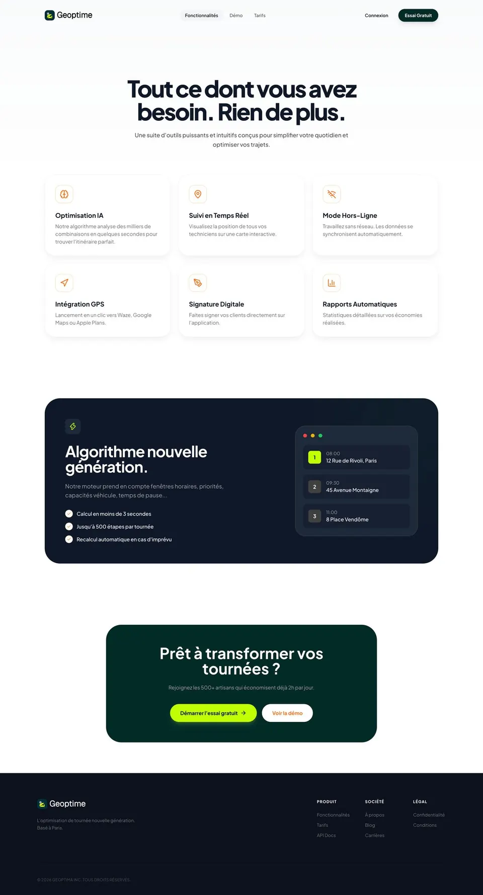
Geoptime helps sales reps, technicians and delivery drivers plan their routes: a map, a customer list, a routing algorithm. The idea started as a student project that a jury member offered to buy. Its founders turned it into a company.
When we joined, the app was running as an MVP. Around it: a domain name, a placeholder logo, empty social accounts. And an uncomfortable question: how do you build a credible B2B brand in a market where Google Maps is already in everyone’s pocket?
90%of competitors use blue
12.5 bn €market in 2025, growing about 15% a year
68%of small businesses still have no dedicated tool
Geoptime’s problem wasn’t existing. It was being recognizable.
The insight
A sea of blue
Before drawing anything, we looked at the market at three levels. The tools local small businesses come across, national players like Antsroute and Mapotempo, and international leaders like OptimoRoute and RoadWarrior. At every level, the finding was the same, and it was visual: corporate blue, tech blue, trust blue. Side by side, these logos are interchangeable.
Hence the call that held the whole project together: step out of the blue without losing professional credibility. In a B2B market, standing out is easy; standing out and staying reassuring is much harder.
The identity
A logo that tells the journey, not just the place.
The mark brings together three elements: the GPS pin for location, the folded map for the route, and the letter G hidden in the shape. Where Google Maps stops at the pin, this one also tells the journey, which is exactly what Geoptime sells.
A first direction, built around ecology, didn’t convince the founders: too much green, not enough technology. We brought it back to the world of geolocation. The ecological idea didn’t disappear, though: it moved into the color.
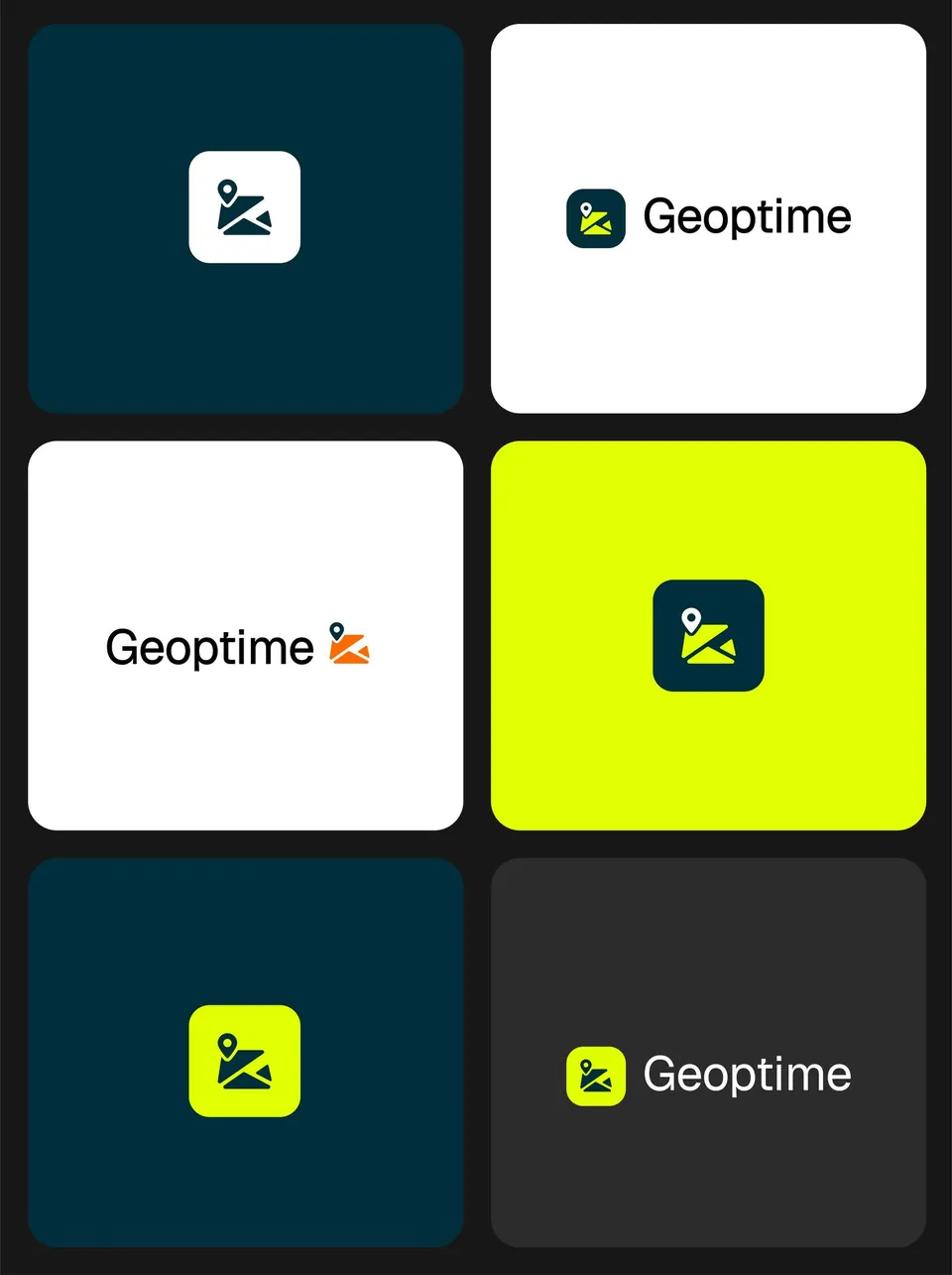
Four color directions were presented to the founders: electric blue, purple, orange, lime green. They chose lime, the color of the green light, of energy, of time saved, and the only one of the four that made any confusion with a competitor impossible.
Blue didn’t disappear, though: it changed roles. From identity color, it became a background, a very dark petrol, almost black, that makes the lime pop. That pairing keeps both promises at once: the lime signals, the background reassures. Orange is only used for accents. The typeface, Geist, provides the balance: geometric, highly legible on screen, technical without feeling cold.
The strategy
A brand, then a plan to make it known.
An identity isn’t enough for a start-up with no customers yet. So we set the communication strategy and the launch marketing strategy, around one simple idea: talk to people losing time on the road, not to people shopping for software.
The target is small businesses with sales reps, technicians or drivers in the field, still planning their routes by hand. The message fits in one promise: time and miles saved, with numbers. And every launch channel, from the website to social media, points to the same proof: try the algorithm yourself.
The product
Two products, one visual language.
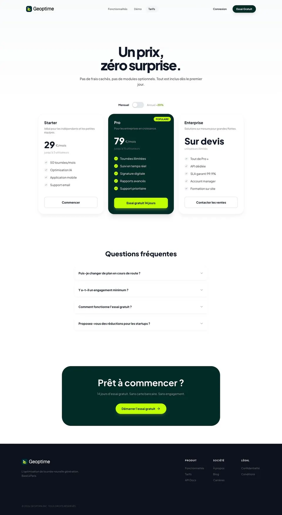
The website had to win over businesses before the product was even out: say clearly what the app does, and make people want to sign up. The app, on the other hand, is used in the field, often one-handed, between appointments, hence screens that focus on one action at a time.
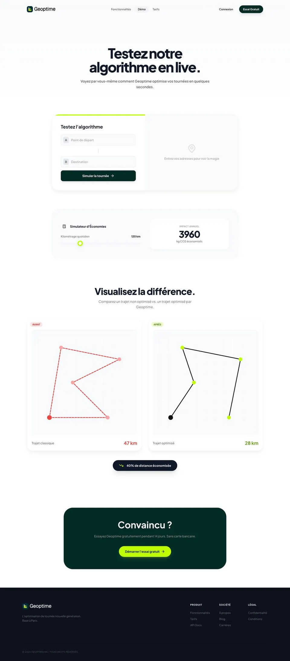
On the website, one decision shaped everything else: don’t describe the algorithm, let people try it. A visitor enters their addresses, sees the route before and after, and reads the savings in kilometers. The demo replaces the sales pitch.
What I took away
The most useful argument in the project wasn’t a hunch. It was a grid.
Putting fifteen competitor logos side by side and seeing they were all blue settled, in one image, a question we could have debated for weeks.
What I’d do differently: present the four color directions earlier. We refined one direction before testing it against the others, when that comparison could have guided the refining.
A two-person project: I led the benchmark, positioning, strategy and the website and app mockups; the visual identity was built together. Launch planned for late 2026 | at this stage, these are deliverables approved by the founders, not usage results.
Recap
The brand guidelines at a glance
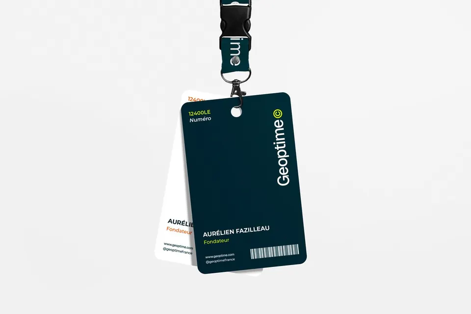
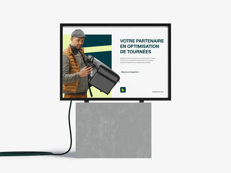
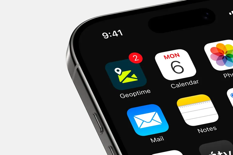
A thirty-page brand book was handed to the founders: logo, colors, typography, usage rules. Here’s how it looks on real-world applications.
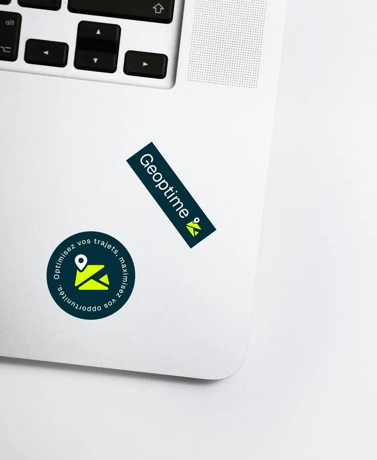
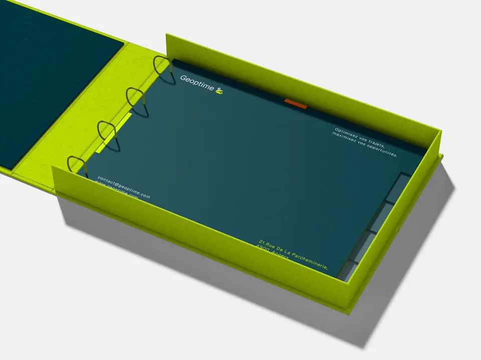
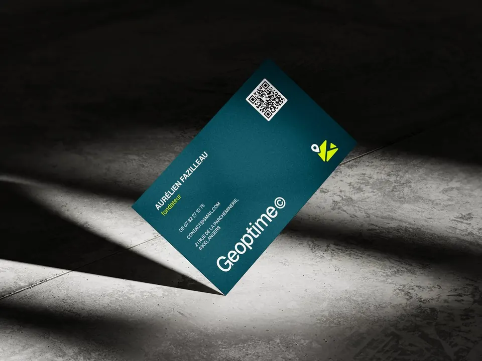
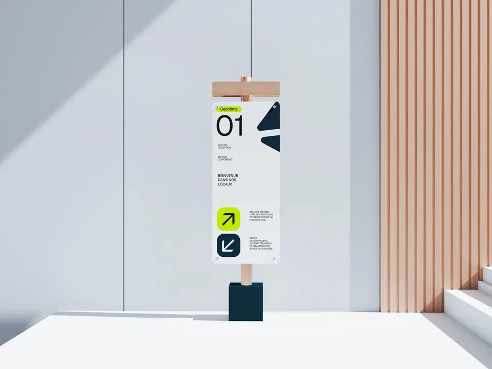
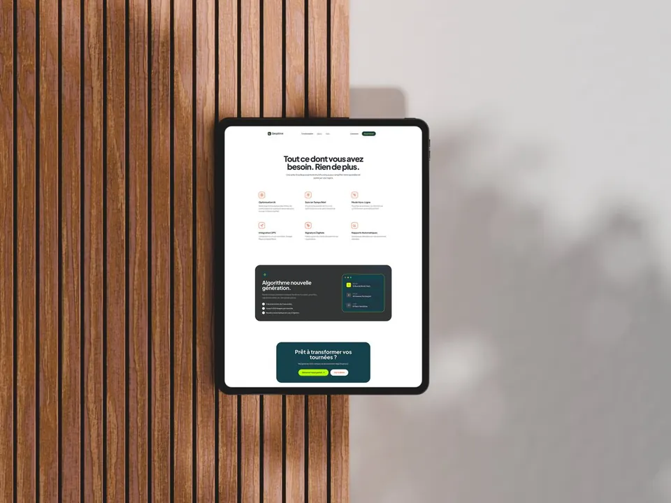
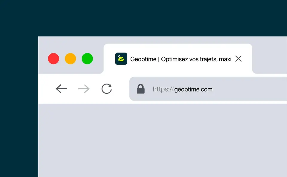
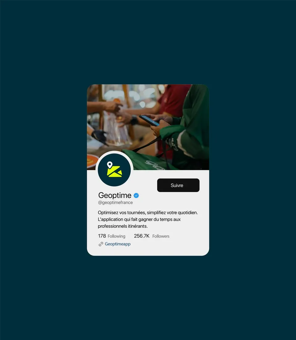
Swipe to browse the applications.
← All work
Next project Winalia.gg →